
THE IDEA
An app that functions as a panic button, letting your loved ones know if you’re in trouble and where you are.
TARGET AUDIENCE
PRIMARY
Shift Worker/Student who needs to feel secure going home at odd hours.
SECONDARY
Someone in an abusive relationship who needs to discreetly send out a distress signal.
DELIVEERABLES
User research
Information architecture
UX design
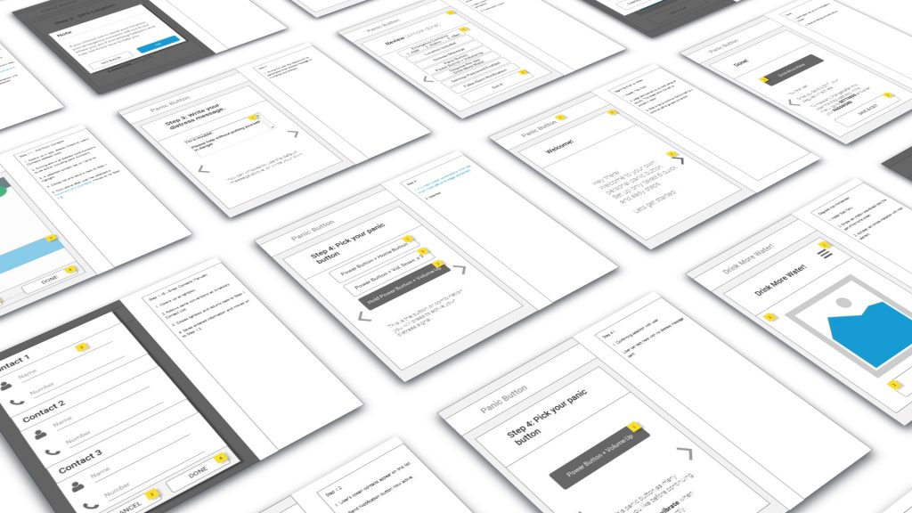
Wireframes
Prototype
Annotation document
SOFTWARE
Axure RP
Photoshop/Illustrator
Google Suite
TIMEFRAME
September – October 2016
RESEARCH
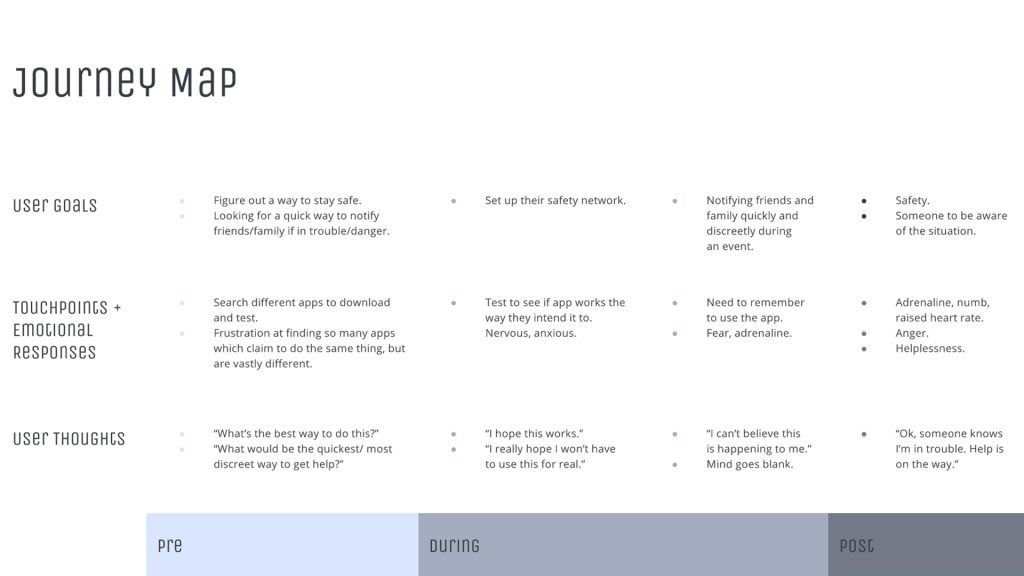
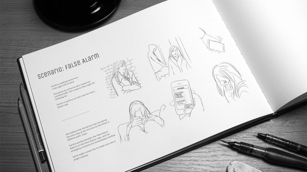
After interviews with four different user types, a user journey was created, along with four scenarios to cover each type of user, and a false alarm situation.
THE CHALLENGE
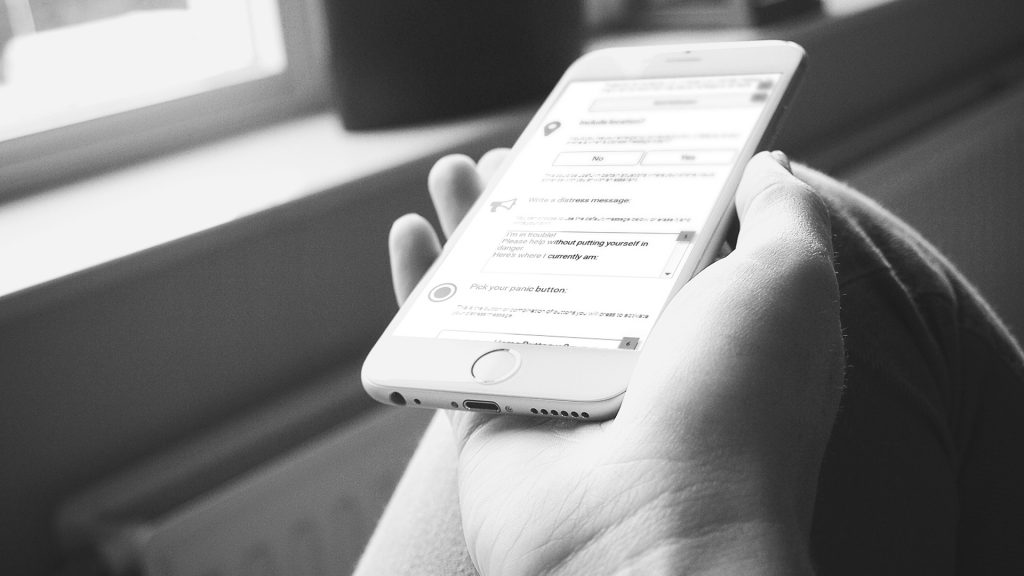
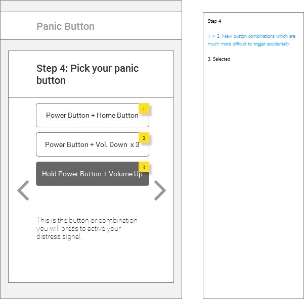
As the front end of a concept like this is fairly simple (press a combination of buttons on your phone to send a distress signal to your emergency contacts), making the set up process easy and not a chore to complete was the real challenge.
USER TESTING + CHANGES
Initially, the Set Up process was designed as one long screen with five sections. However, users found this to be overwhelming. This was redesigned to be a series of cards, which the users found to be much more palatable.
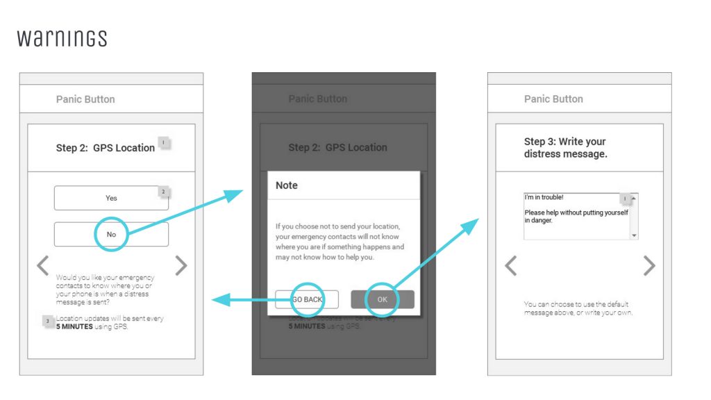
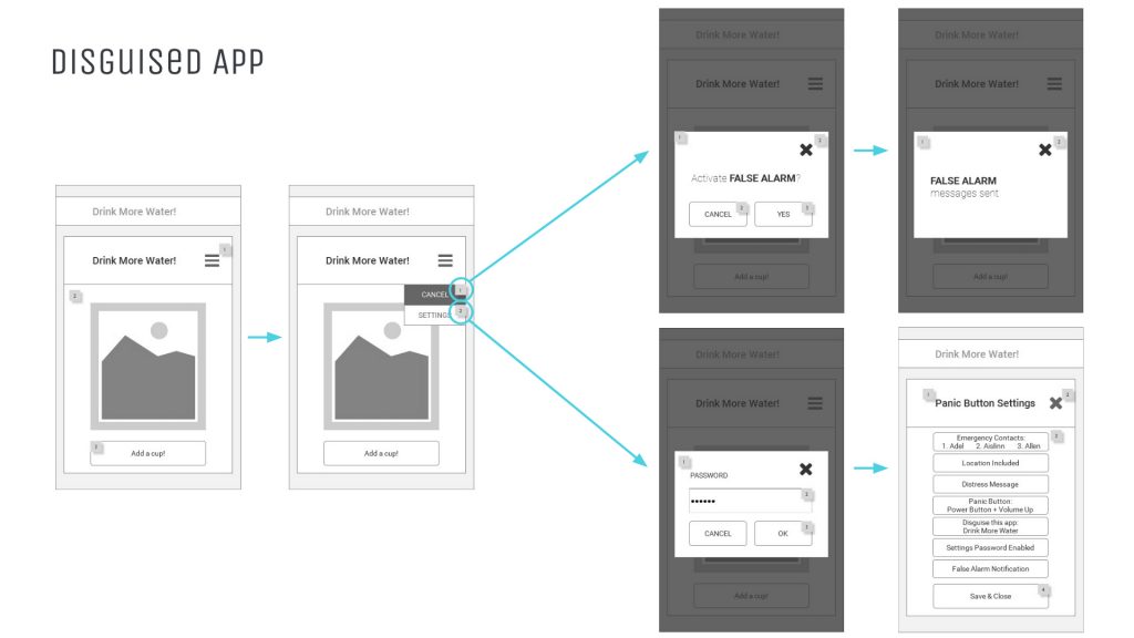
Certain features were also added, like warnings if the user opts out of particular features, and the ability to disguise the application as something benign for the secondary target audience.
On testing, this was too long, with too much scrolling. Testers felt lost halfway through, not having a reference point as to where they were in the process.
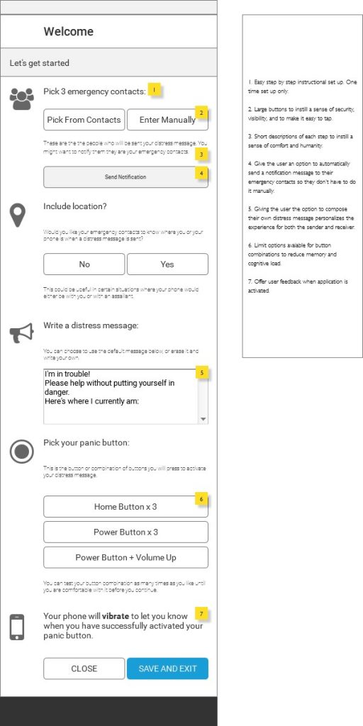
Just because it takes less clicks, or it’s all on one page, doesn’t make it more usable.
Dividing everything into smaller steps (cards) helped keep the testers focused on each task. Adding numbers to the steps helped them approximate where they were in the process.
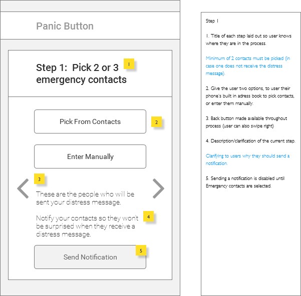
Sometimes, more clicks means reducing the amount of information to be processed at a time, which leads to a lower cognitive load.